


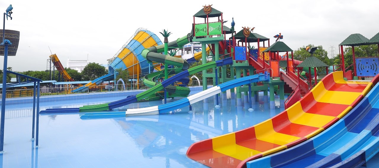


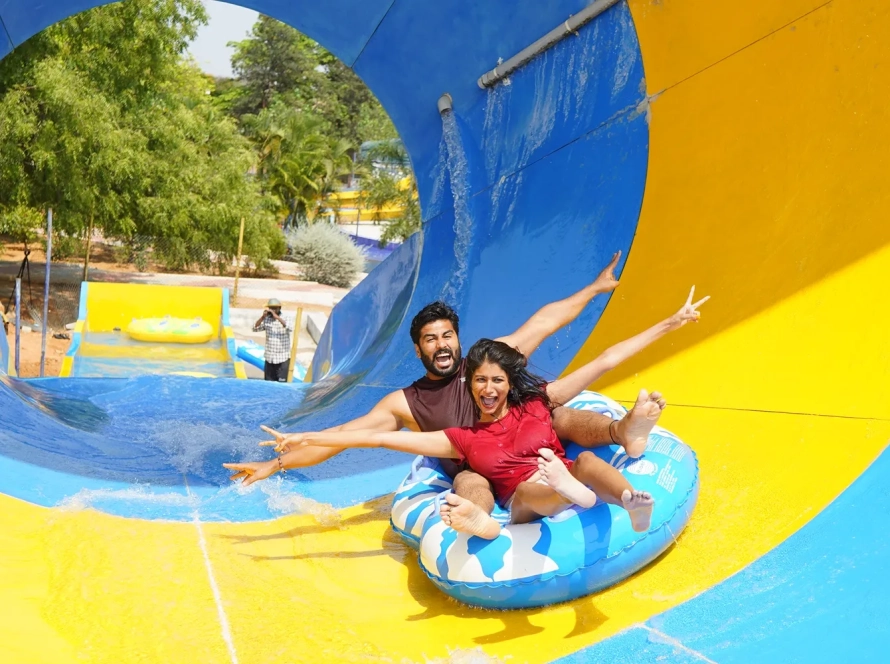
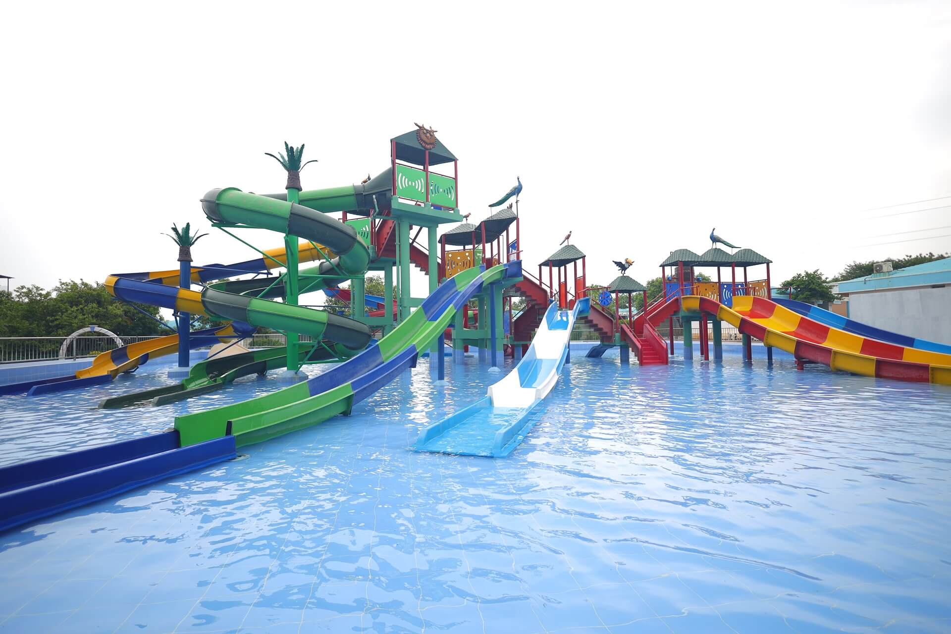
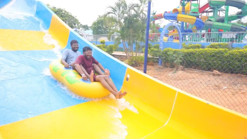
01.High Thrill Rides
02.Kids Play Pen
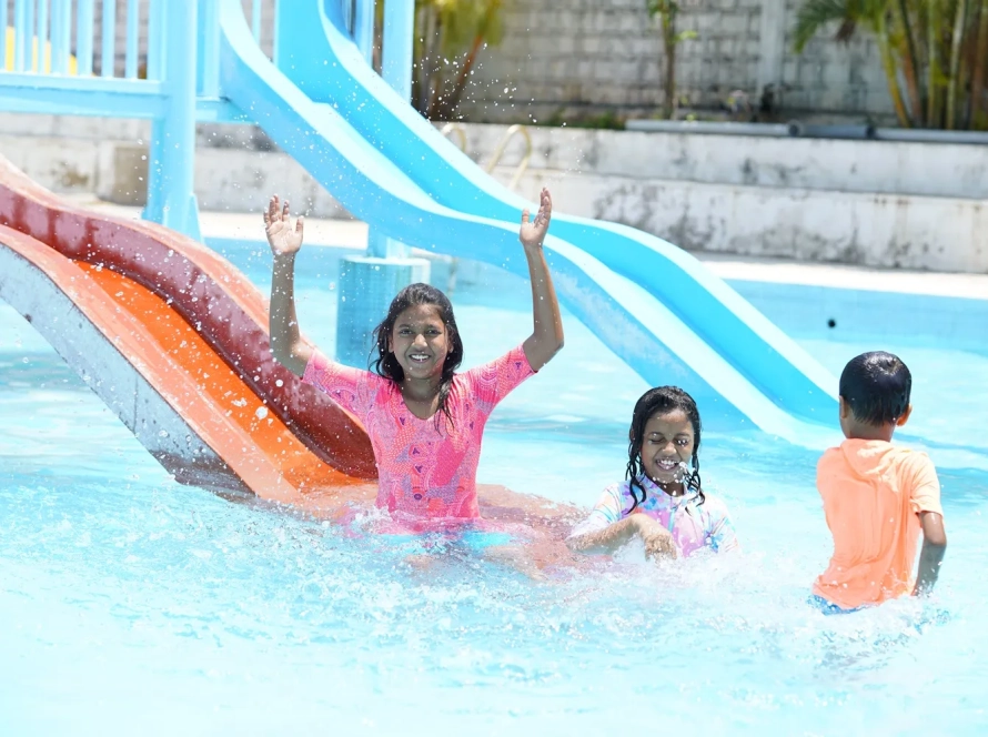
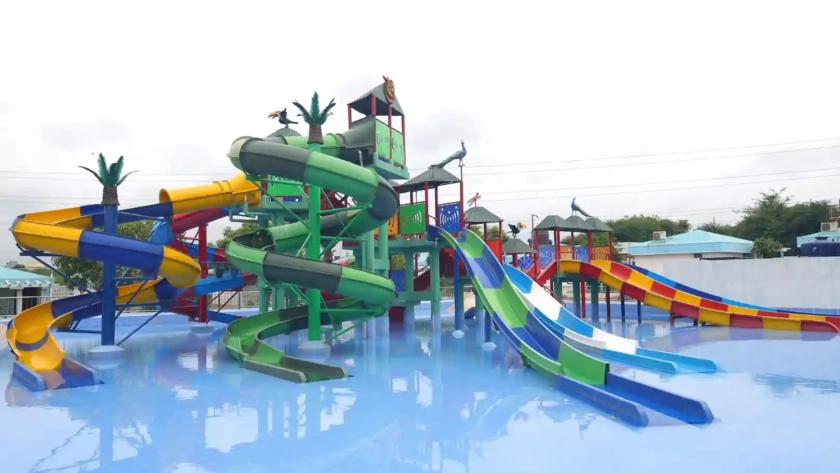
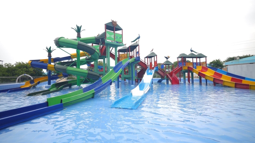
03.Kids Water Rides
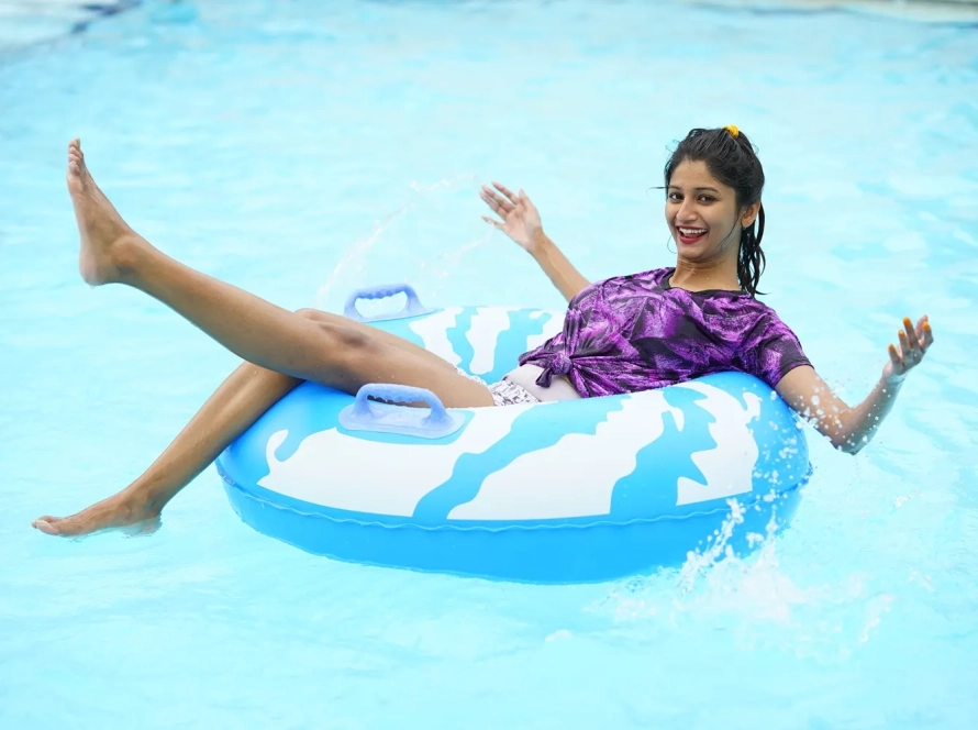
04.Lazy Pool
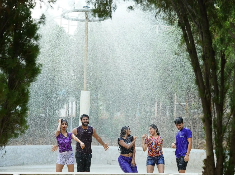
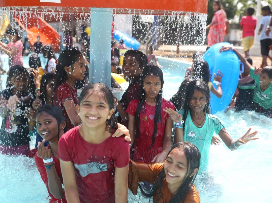
05.Rain Dance
06.Splashing Buckets


Craving a refreshing escape or a day of family fun in Hyderabad? Look no further than BlüThunder Water Park, the best water park in Hyderabad! Nestled amidst serene greenery, this Hyderabad gem offers the perfect blend of water rides in Hyderabad, a rain dance floor, and a dedicated children’s play area.
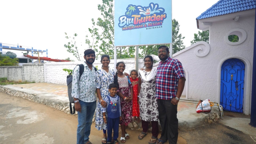
BlüThunder Water Park caters to all, making it an ideal destination for families, corporate events, school picnics, college outings, and even birthday party locations near me. It’s truly the best place to celebrate a birthday in Hyderabad! Discover the best water amusement park in Hyderabad, best adventure park in Hyderabad, experience exhilarating water games in Hyderabad, and explore the best water theme park in Hyderabad – all at BlüThunder!
Welcome to BluThunder, the ultimate water and adventure park in Hyderabad! Experience the thrill of exhilarating water rides, the adrenaline rush of adventure activities, and the pure joy of aquatic fun. BluThunder proudly ranks as the best water park, adventure park, water theme park, and amusement park in Hyderabad. Get ready for the best water games in the city and discover why we’re a top choice for water amusement parks near you! If you’re searching for the best place to celebrate a birthday in Hyderabad, BluThunder is the answer. We offer amazing birthday party locations near you and are widely considered one of the best birthday party places in Hyderabad – perfect for celebrating with close ones!
Experience the Ultimate Water Adventure at BlüThunder Water Park!
Escape the ordinary and immerse yourself in a world of aquatic thrills! Whether you seek heart-pounding slides, the gentle flow of a lazy river, or the pulsating energy of a rain dance party, BlüThunder Water Park has something for everyone.
With an array of activities including Water Rides, Rain Dance, Lazy Pools, and Kids’ Play Areas, BluThunder Water Park offers the perfect setting for team bonding. Our Outdoor Banquet Area ensures a memorable and productive team outing.
We offer customized Corporate Packages according to your plan, promising an unforgettable experience. This trip down memory lane is sure to make you re-live your good old days. Reminiscing the glorious times of life.
Book your package now and embark on a journey down memory lane!
Reach out to us today to customize your ideal Corporate Package.
Create Unforgettable School Trips at BluThunder Water Park!
Childhood memories are made of fun and adventure! At BluThunder Water Park, our carefully designed School Packages ensure students have a blast while providing organizers with peace of mind.
Let’s make your next school outing a splash! Contact us today to customize your BluThunder Water Park experience.
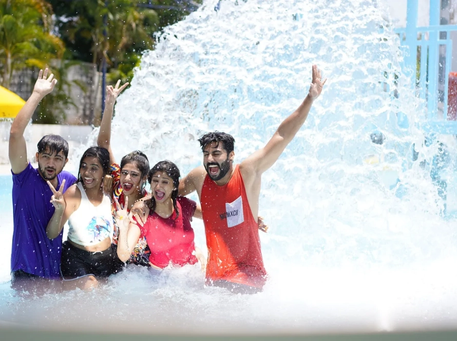
Experience the ultimate splash at BluThunder Water Park! Get your adrenaline pumping on our exhilarating high-thrill rides, or let the little ones loose in our dedicated kids' play pen and water rides. Take a relaxing float down the lazy pool, get soaked under the splashing buckets, and unleash your inner dancer in the rain dance zone. BluThunder has something to make a splash for everyone!
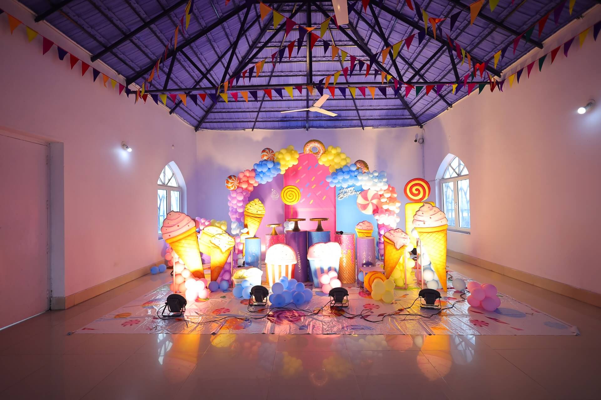
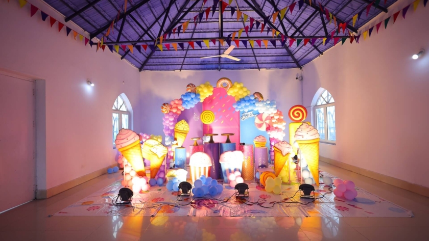
BluThunder Water Park is the perfect setting for birthdays, family gatherings, and anniversary celebrations. With thrilling rides, delicious dining options, and accommodating spaces, we ensure a memorable experience for all. Make a redudant and cherish special moments with us at BluThunder!
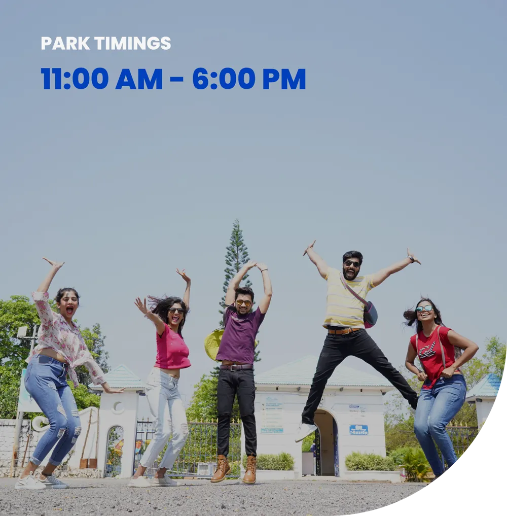
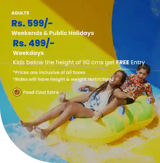
Get ready to splash into fun at BluThunder Water Park! We're open daily from 11 AM to 6 PM. Enjoy thrilling water slides and attractions at an incredible price – ₹599 on weekends & Public holidays. Come beat the heat and create unforgettable memories at BluThunder!
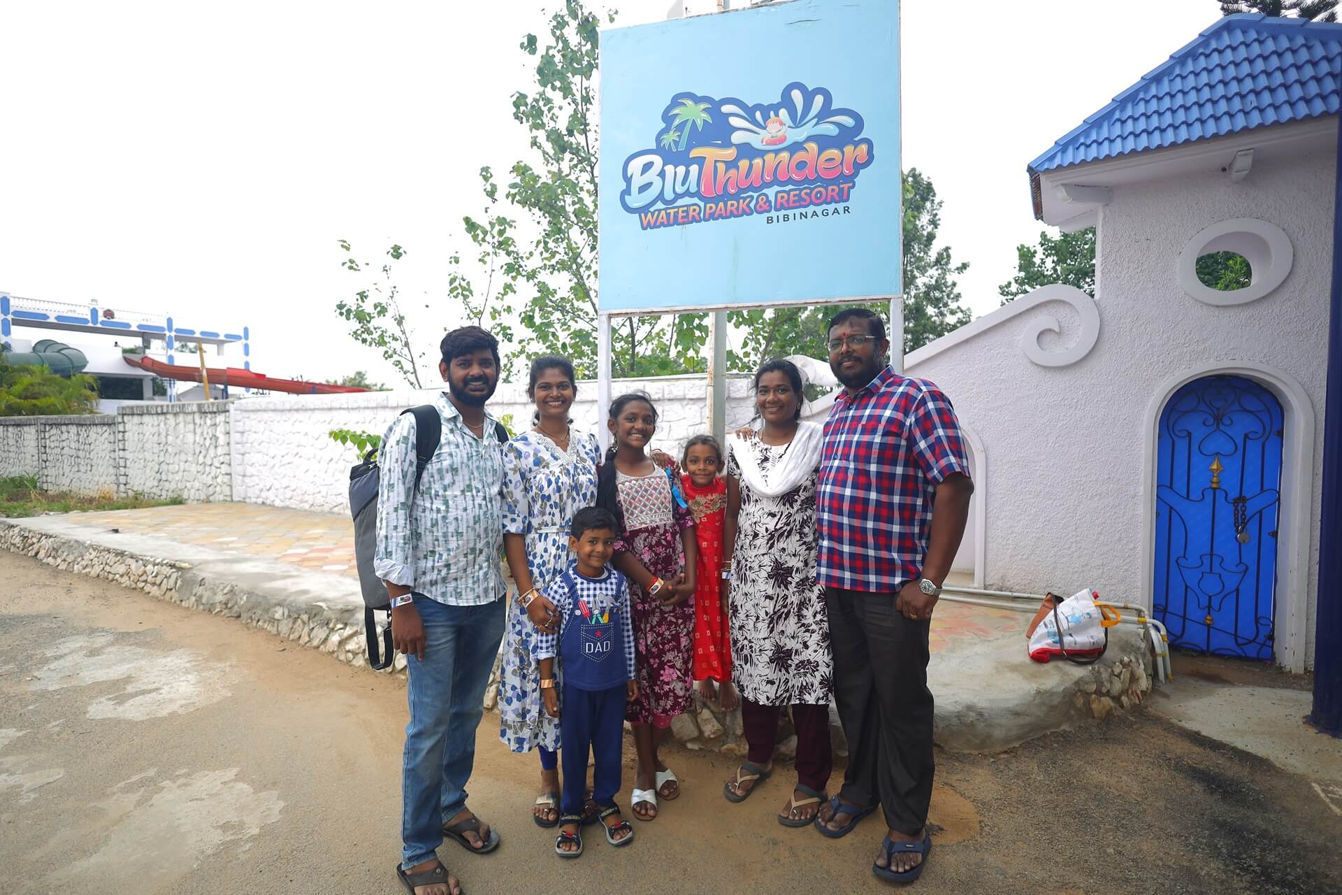
Best place to visit with family and friends, They provide a Great service, have a great time…!!
Awesome place for Complete relaxation with Family and friends.
Very good place for kids and adults all the water rides are very good.
BluThunder is a thrilling water and adventure park in Hyderabad, perfect for birthday parties and fun with friends! Experience the best water rides and amusement park attractions.
Location: Inside Super City Venture, Raghavpur Village, Pochampally Road, Bibi Nagar, Nalgonda Dist – 508126.
BluThunder is the best water park in Hyderabad, offering thrilling water rides, adventurous experiences, and a fantastic place to celebrate birthdays. If you’re looking for the best water amusement park in Hyderabad, or even the best amusement park in general, BluThunder is a top choice. Find us at – Raghavpur Village, Pochampally Road, Bibi Nagar, Nalgonda Dist – 508126.
BluThunder water park in Hyderabad, one of the best adventure parks, operates from 11 am to 6 pm. Enjoy water rides and games at this top-notch water amusement park, ideal for birthday celebrations with friends.
BluThunder, the best water and adventure park in Hyderabad, offers free entry for kids under 90 cms tall. Celebrate birthdays and enjoy water rides at the best water amusement park in Hyderabad!
No, outside food and drinks are not allowed in the park. However, there are various options available within the park where you can purchase food and drinks. You can go through our menu for prices when you are here. Our food prices start at Rs.80/-. The food and drinks are not complimentary and we do not serve alcoholic beverages. Please call on 7337333426/427 for any more queries.
Yes, we offer a space for medium sized group birthday party. Please call on 7337333426/427 for any more queries.
Experience thrilling water rides at BluThunder Water Park in Hyderabad! Enjoy adventurous rides, lazy pools, rain dance, and splashing buckets. Perfect for birthdays and fun with friends!
BluThunder Water Park in Hyderabad is perfect for family visits with young children. With thrilling rides, kids safe zones, and play areas, it’s the best water amusement park in Hyderabad. Ideal for birthdays or any other mini gatherings with family and friends.
Yes, BluThunder offers rain dance facilities, making it a top choice for water park enthusiasts in Hyderabad. Enjoy thrilling water rides and attractions at one of the best adventure parks in the area, perfect for birthday celebrations with friends.
We have different options for any corporate team outings, reach us at 7337333426/427 for further more queries.
We make these Childhood memories special at BluThunder Water Park with our School Packages designed to give enjoyable experiences for Children and comfort for organizers. Please call on 7337333426/427 for any more queries.
BluThunder Water Park is an ideal spot for birthday celebrations with its thrilling rides and family-friendly atmosphere.
From small sized to medium sized groups, all are welcome to our water park.
Yes, there is a dress code for the water park. You need to wear nylon clothes that we have put out for sale at the price of Rs. 250/- . Appropriate swimwear is required for all water rides, and any clothing with offensive language or images is prohibited. Everyone has to adhere to these. Please call on 7337333426/427 for more queries.
You can only wear nylon clothes/dresses inside our pools. This applies to all those who come here. We also offer nylon clothes for sale at our counters. Please call us on 733 7333 426/ 733 7333 427 for more queries regarding the costume.
You can contact our customer service team at 7337333426/427 to look out for such discounted bookings.
No. You can contact our customer service team at 7337333426/427 to know more.
You can contact our customer service team at 7337333426/427 to know for such packages.
The ticket price at BluThunder Water Park is Rs.499/- on weekdays and Rs. 599/- on weekends, public holidays and kids below 90 cms get free entry. You can call on 7337333426/427 to book your tickets. You can also book tickets at our bookings counter. This is our address: BluThunder Water Park and Resort Inside Super City Venture Pochampally Road, Bibi Nagar, Nalgonda Dist, Telangana 508126.
You can contact our customer service team at 7337333426/427 to look out for such discounted bookings.
Park will be Open Only On Weekends and Public Holiday From July 1st 2025 . For Bulk Booking and General Enquiries Contact On 733733426/427
Important Warning: Protect Yourself from Fake Ticket Websites!
Dear Valued Bluthunder Water Park Guests,
It has come to our attention that unauthorized and fake websites are attempting to sell tickets to Escape Water Park. Please be aware that these websites are fraudulent and are designed to scam unsuspecting customers.
Do not be a victim of these scams!
Contact 7337333427 for any information